- Product launch concept
- Go-to market strategy
- Global marketing toolbox
- Film production
- Photo production
- Packaging design
- Social media content
- Webdesign
- Graphic design
- Event
The challenge
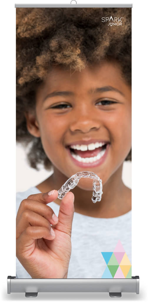
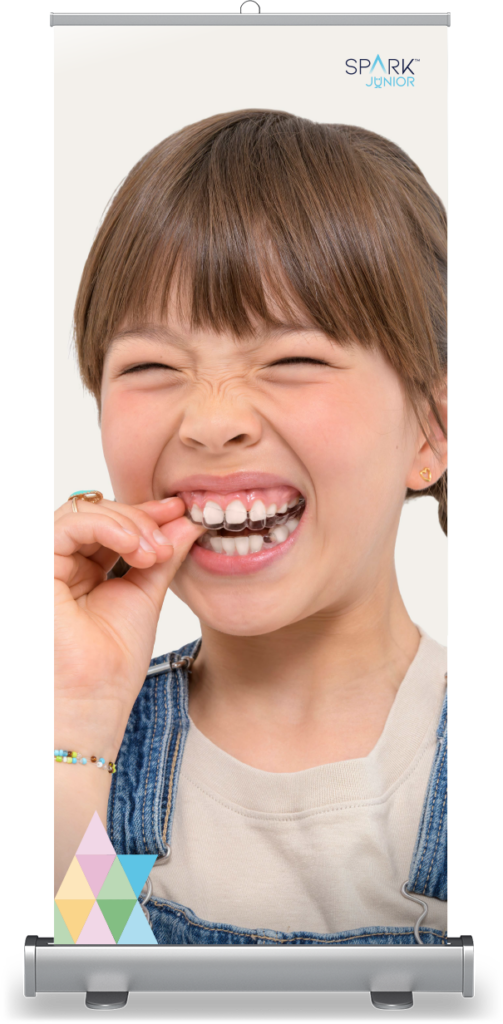
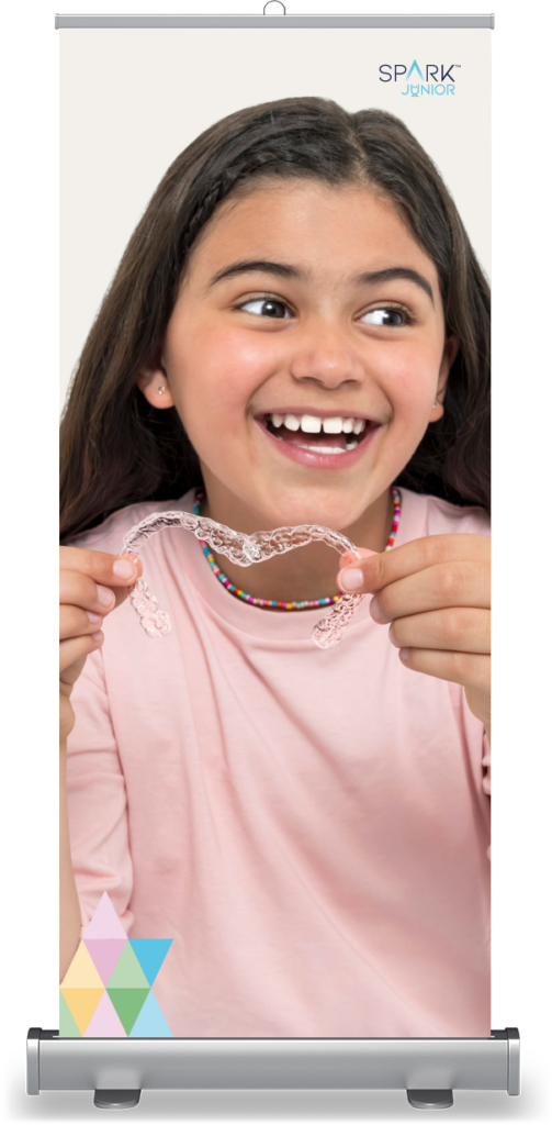
Spark is Ormco’s premium clear aligner brand, offering nearly invisible orthodontic solutions for adults. With the launch of Spark Junior, a discreet alternative to braces for children aged 6 to 13, the brand needed to stand out in a crowded European market and wow orthodontists, parents, and kids from day one.
Approach
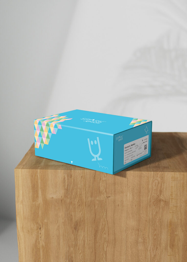
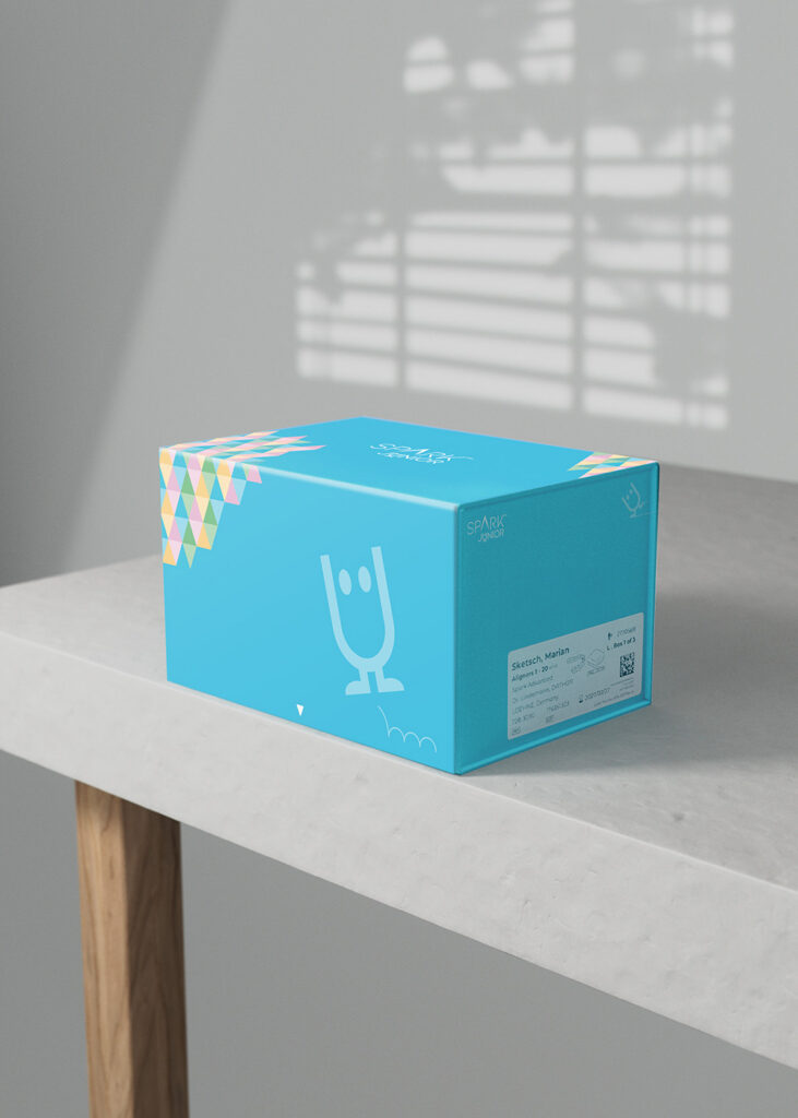
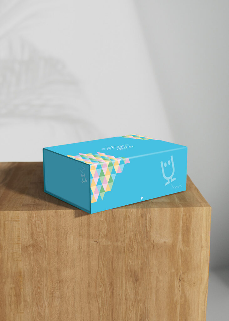
Advance developed a value proposition, visual identity and tone of voice that defined how to talk to young patients through their parents and orthodontist. We introduced a mascot for Spark Junior to help make the orthodontic journey more palatable for little ones. A launch toolbox was defined and geared towards both doctors, and parents and their kids.
Solution
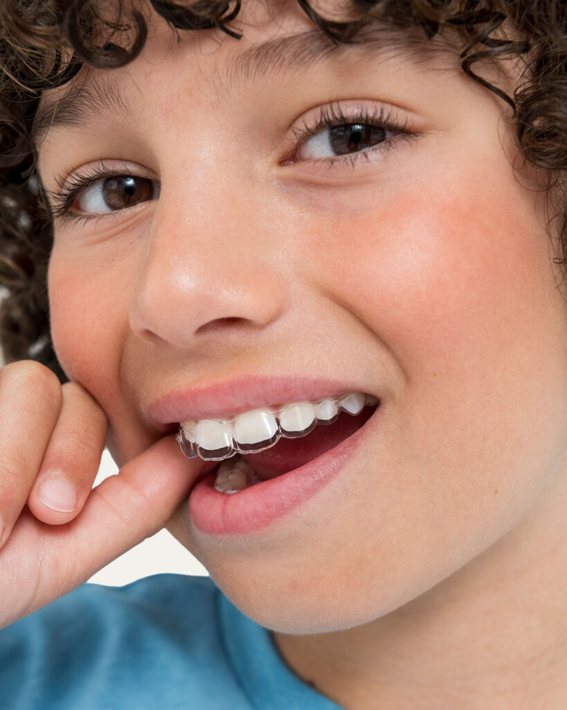
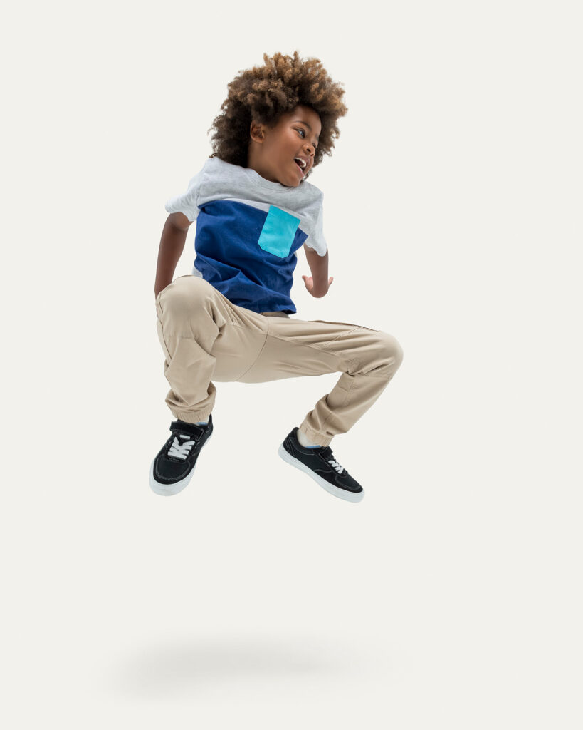
The sub-brand was designed to feel playful and energetic, expressed through new colours, graphic elements, and vibrant photography of children aged around eight. Advance led the photoshoot process from start to finish, including casting, shooting, selection and grading.
The mascot, Sparky, was brought to life in a fairytale world designed to engage and educate kids and their parents about the teeth alignment process. The launch toolbox boasted a unique illustration style developed for Spark that used the new playful pastel palette – these illustrations were even turned into fun stickers.
Result
The new sub-brand was very well received both internally at Ormco and within the wider dental community. It clearly differentiated itself from competitors by introducing a more human, consumer-facing identity in a traditionally clinical category. As one Ormco representative noted, no other dental brand at the time had a mascot – positioning Ormco as ahead of the game.