Øresundsbron

The bridge that brings us together

Here are descriptive alt text options for this batch of corporate visual identity brand guidelines:

Screenshot 2026-06-16 at 16.26.17.jpg
alt="An angled, bird's-eye grid view of numerous digital slides from the Øresundsbron Corporate Visual Identity (CVI) 2022 guidelines. The brand deck features sections on logo usage, typography hierarchy, social media, a blue-toned color palette, stationery formats (A4, A5, A6), and photographic styles showcasing the Øresund Bridge at sunrise and sunset.
Client
Øresundsbron
Task
Rebranding
Deliverables
  • Brand strategy
  • Brand campaign
  • Graphic design
  • TVC
  • Social media content
  • Webdesign
  • Digital design
  • Campaign concept
  • Naming
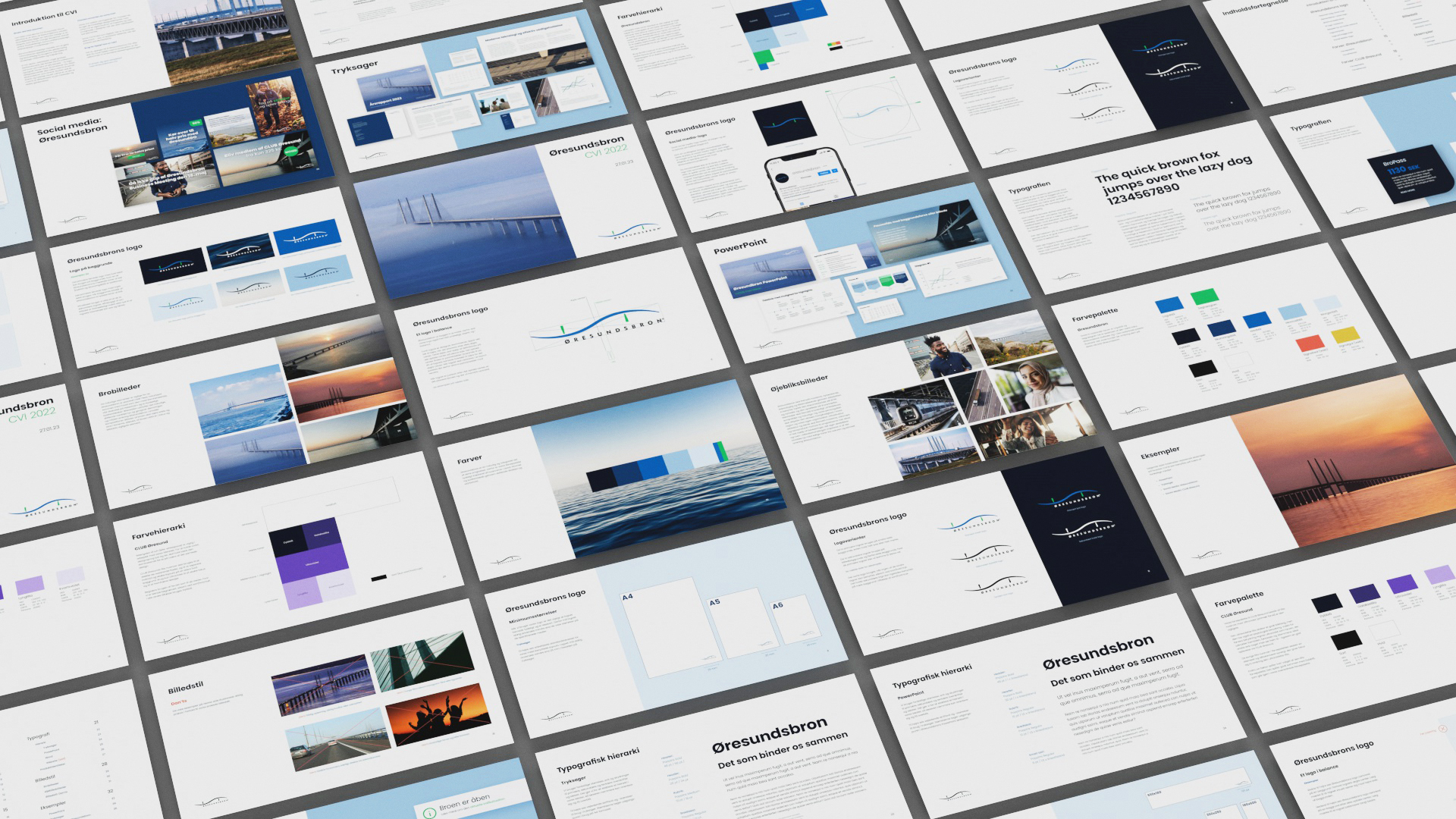
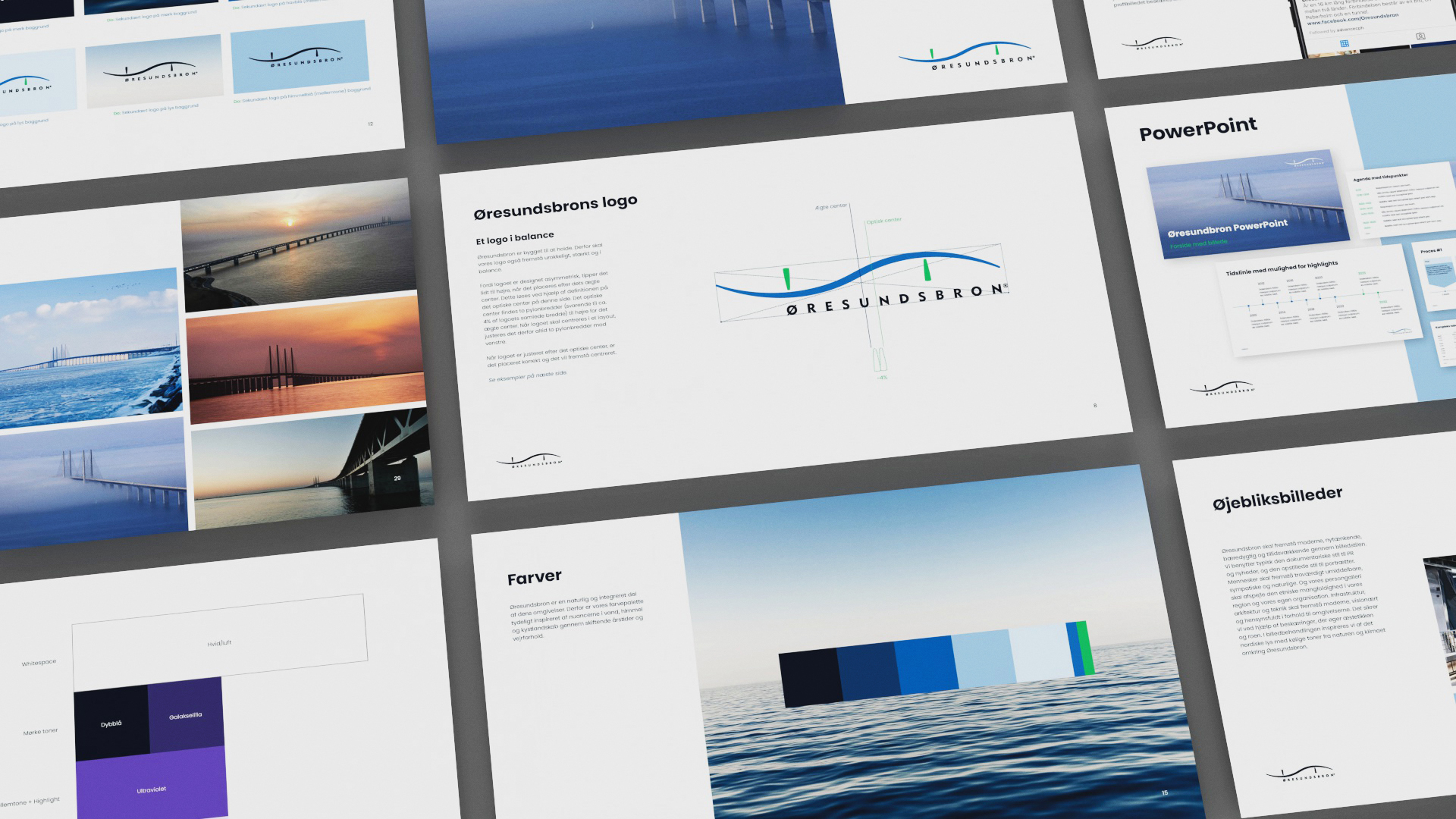
  • Corporate visual identity
  • PR

The challenge

BroPas had more than 500,000 subscribers availing of discounts on drives across the 16 km long Øresund Bridge between Sweden and Denmark. To both retain these users and attract new ones, the brand needed a refresh and new product names. The work also had to strengthen cultural and economic ties between Sweden and Denmark.

Approach

The name of the otherwise popular BroPas suddenly evoked associations with “corona passports.” Our analysis also revealed that many customers confused BroPas with Brobizz.

Solution

We developed the new name ØresundGO®, which encouraged people to drive whenever they wanted while strongly connecting to the bridge’s identity. To launch ØresundGO, we produced an entertaining musical advertisement that firmly established the name with song and dance.

Result

Øresundsbro Konsortiet had a record year in 2023 with a revenue increase of DKK 398 million. Danish leisure traffic with ØresundGO® rose by 23%, while more customers were gained and driving frequency increased.

An identical bird's-eye perspective grid layout of the Øresundsbron 2022 brand guidelines presentation slides, displaying various design rules for typography, layout blocks, color chips, and photography assets related to the bridge infrastructure.
A close-up view focusing on four specific slides from the Øresundsbron brand manual. The top-left slide features a grid of landscape photos of the bridge. The top-right slide explains the 'Øresundsbrons logo' geometry with axis lines over its wave design. The bottom-left slide shows a dark purple color hierarchy block, and the bottom-right slide features a color palette bar ranging from dark navy to bright green over a calm ocean background image.